How EEG Is Changing User Experience Research

The Most Expensive Lie in Product Design
In 2012, a UX research team at Google ran a study on visual complexity. They showed users two versions of a search results page and asked which one they preferred. Users overwhelmingly said they preferred the simpler design. Clean. Minimal. Easy on the eyes.
There was just one problem. When the researchers tracked actual behavior, users performed better and engaged more with the slightly more complex design. The one they said they didn't like.
This isn't an anomaly. It's the norm. And it points to something that should genuinely alarm anyone who builds products for a living: your users are lying to you. Not on purpose. Not maliciously. They're lying because the human brain is spectacularly bad at introspecting on its own processes. People don't know why they clicked that button. They don't know why they hesitated on that screen. They don't know why one checkout flow felt frictionless and another made them abandon their cart.
Ask them, and they'll give you an answer. They'll give you a confident, articulate, completely fabricated answer, because the brain would rather confabulate than admit ignorance about its own workings.
This is the fundamental problem of UX research. The most important data, what's actually happening in the user's mind during a product interaction, is locked inside their skull. Surveys can't reach it. Interviews can't reach it. Even eye tracking only tells you where someone looked, not what they thought about what they saw.
But there's a signal that doesn't lie. It can't lie. It's the raw electrical output of the brain itself. And you can read it in real time.
What Your Brain Broadcasts When It Encounters Bad Design
To understand how EEG works in UX research, you need to understand something fundamental: your brain reacts to confusing interfaces the same way it reacts to any cognitive challenge. It works harder. And when it works harder, it broadcasts specific, measurable electrical signatures.
These aren't subtle signals buried in noise. They're well-characterized, well-replicated patterns that neuroscientists have been studying for decades in other contexts. UX researchers have simply figured out that the same signals the brain produces during a difficult math problem also appear when a user encounters a poorly labeled navigation menu.
Here are the four brainwave metrics that matter most for UX.
Frontal Theta: The "I'm Confused" Signal
When your brain encounters something that demands working memory, your frontal cortex starts producing more theta brainwaves (4 to 8 Hz). The harder the cognitive task, the stronger the theta. This relationship is so reliable that frontal theta power has become the gold standard EEG metric for cognitive load in applied research.
In a UX context, frontal theta spikes tell you exactly where users are struggling. A confusing form layout? Theta goes up. An ambiguous icon? Theta goes up. A checkout flow that requires the user to remember information from three screens ago? Theta goes through the roof.
The power of this metric is its temporal resolution. Surveys ask users to reflect on their experience after the fact, collapsing minutes of interaction into a single rating. EEG catches the exact 500-millisecond window where confusion hit. You can pinpoint not just that a screen was confusing, but which specific element on that screen caused the confusion, and exactly when.
Alpha Suppression: The "I'm Engaged" Signal
alpha brainwaves (8 to 13 Hz) dominate when brain regions are idling. When a region gets recruited for active processing, alpha power drops. Neuroscientists call this alpha desynchronization, and in UX research, it's your engagement meter.
Low alpha over parietal and occipital regions means the user's visual and attentional systems are actively processing what they're seeing. High alpha means they've mentally checked out. You've lost them. They might still be looking at your interface, but their brain has moved on.
This matters enormously for content-heavy products. You can have a user staring directly at your onboarding tutorial, and alpha power will tell you whether their brain is actually absorbing the information or whether they're running their grocery list in the background while their eyes do a convincing impression of reading.
Frontal Alpha Asymmetry: The "I Like This / I Hate This" Signal
This one is fascinating. Your left and right frontal cortex respond differently to positive and negative experiences. Greater activation (meaning lower alpha power) over the left frontal region is associated with approach motivation, the brain state of wanting to engage with something. Greater right frontal activation is associated with withdrawal motivation, the brain state of wanting to pull away.
In UX research, frontal alpha asymmetry lets you detect emotional valence in real time. Is this onboarding screen creating curiosity (left-dominant) or frustration (right-dominant)? Does this error message trigger resignation or determination? Is the user about to abandon the flow, or are they about to push through?
A 2019 study by Giraud and colleagues published in International Journal of Human-Computer Studies used frontal asymmetry to evaluate website aesthetics. They found that the brain's approach/withdrawal response predicted user preference more accurately than self-reported ratings. Users' brains decided whether they liked a design within 500 milliseconds, long before the users themselves could articulate an opinion.
Research consistently shows that your brain forms an aesthetic judgment about a website or interface within 50 to 500 milliseconds of first exposure. This happens faster than conscious deliberation. EEG captures this instant verdict through frontal alpha asymmetry and early event-related potentials, giving UX researchers access to the brain's "first impression" before rationalization takes over.
Beta and Gamma: The Fine-Grained Attention Signals
beta brainwaves (13 to 30 Hz) increase during active, focused thinking. Gamma waves (30 to 100 Hz) are associated with feature binding, the process by which your brain integrates different aspects of a visual scene into a coherent percept. Together, they provide a fine-grained picture of how actively and effectively a user is processing an interface.
High beta combined with high theta (what researchers call "engaged struggle") tells a different story than high beta with low theta ("productive focus"). This distinction is invisible to behavioral metrics but vivid in EEG data.
Why Self-Report Is Broken (And Why UX Researchers Keep Using It Anyway)
The case against relying solely on self-report in UX research isn't theoretical. It's been documented so thoroughly that it's almost embarrassing how much of the field still depends on it.
Here's the problem in a nutshell: self-report is contaminated by at least four well-documented biases, and every one of them is devastating for UX research specifically.
Social desirability bias. Users tell you what they think you want to hear. "Yeah, the new design is great!" they say, while their frontal cortex is screaming in theta.
Peak-end rule. People's memory of an experience is dominated by the most intense moment and the final moment. Everything in between gets averaged into mush. A checkout flow could have three moments of brutal confusion in the middle, but if it ends smoothly, users will rate the entire experience as "pretty good."
Rationalization. The brain generates post-hoc explanations for decisions it made unconsciously. A user might say "I clicked that button because the label was clear" when eye tracking shows they never read the label. They clicked it because it was the largest element on the screen. Their brain just decided to tell a nicer story about it.
Temporal imprecision. Asking "how was your experience?" after a 10-minute interaction is like asking "how was the weather?" after a week-long trip. The answer is a compressed, lossy summary that destroys the moment-by-moment detail that actually matters for design decisions.
Self-report captures the user's conscious, retrospective narrative about their experience. It is filtered through memory, social pressure, and rationalization. Temporal resolution: minutes to hours.
EEG captures the brain's involuntary, real-time electrical response to each moment of the interaction. It is not filtered through conscious interpretation. Temporal resolution: milliseconds.
The two methods don't compete. They complement each other. Self-report tells you the story the user tells themselves. EEG tells you the story their brain is actually living.
EEG doesn't replace surveys and interviews. It fills the massive gap between what users say and what their brains actually do. The most sophisticated UX research labs in the world now use both, triangulating self-report, behavioral metrics, and neurophysiological data to build a complete picture of user experience.
The EEG-Enhanced A/B Test: Where This Gets Practical
Let's make this concrete. Imagine you're running an A/B test on two checkout flow designs.
Design A is traditional: a multi-step form with progress indicators, one section per page. Design B is a single-page flow with expandable sections. Standard analytics might tell you that Design B has a 3% higher conversion rate. Case closed. Ship it.
But here's the thing EEG reveals that click data doesn't: Design B's higher conversion rate might be driven by a completely different mechanism than you think.
| Metric | Design A (Multi-Step) | Design B (Single-Page) | What It Means |
|---|---|---|---|
| Conversion Rate | 68% | 71% | Design B wins on behavior |
| Avg. Frontal Theta | Lower overall | Higher overall | Design B imposes more cognitive load |
| Theta Spike Locations | Spread across steps | Concentrated at payment section | Design B front-loads confusion |
| Alpha Engagement | Drops at Step 3 | Sustained throughout | Design B keeps users more engaged despite higher load |
| Frontal Asymmetry | Neutral | Left-dominant (approach) | Users feel more positively toward Design B |
| Post-Task Satisfaction | 3.8 / 5 | 4.1 / 5 | Self-report favors Design B slightly |
This table tells a nuanced story that neither behavioral data nor self-report alone could reveal. Design B works better, but not because it's simpler. It's actually more cognitively demanding overall. It works because it sustains engagement and generates positive emotional responses. The higher theta is "productive struggle," not confusion.
Without EEG, you'd ship Design B and learn nothing about why it works. With EEG, you understand the mechanism, which means you can apply the same principles to your next ten design decisions without running another A/B test each time.
Building an EEG-Enhanced UX Research Protocol
If you're thinking about adding EEG to your UX research toolkit, here's what a practical protocol looks like. This isn't a clinical neuroscience lab setup. This is real-world UX research that happens to include brain data.
Phase 1: Baseline Capture (2 to 3 minutes)
Before any task interaction, record a resting baseline. Have the participant sit quietly with eyes open for one minute, then eyes closed for one minute. This gives you each person's individual baseline brain activity. All subsequent metrics are calculated relative to this baseline, which accounts for natural variation between people.
Phase 2: Task Interaction With Time-Locked EEG (5 to 15 minutes per task)
The participant uses the product or interface while wearing the EEG device. Every screen transition, click, hover, and scroll event gets time-stamped and synced with the EEG recording. This time-locking is what makes the data useful. You can go back and see exactly what the brain was doing at the moment a user hesitated on a dropdown menu.
Phase 3: Concurrent Think-Aloud (Optional)
Some researchers ask participants to narrate their thoughts during the task. This is tricky with EEG because jaw movement creates muscle artifacts in the signal. If you use think-aloud, keep it minimal. Brief observations rather than continuous narration. The EEG data is filling the gap that think-aloud usually covers anyway.
Phase 4: Post-Task Survey and Retrospective Interview
After the interaction, collect standard self-report measures: System Usability Scale (SUS), NASA-TLX for perceived workload, satisfaction ratings. Then, and this is where EEG makes the interview radically better, replay the session recording and show the participant their own brainwave data.
"Here's a moment where your cognitive load spiked. What was happening for you here?"
This technique, called stimulated recall with neurophysiological cues, produces dramatically richer interview data than standard retrospective protocols. Users can't introspect on their cognitive load in the abstract, but when you show them the exact moment their brain struggled, memory comes flooding back.
Phase 5: Analysis and Triangulation
The real power emerges when you overlay three data streams: behavioral (clicks, completion time, errors), neurophysiological (theta, alpha, asymmetry), and self-report (surveys, interview themes). Disagreements between these layers are where the most valuable insights hide.
When behavior and brain data agree but self-report diverges, you've found a rationalization gap. The user can't explain their own experience accurately.
When self-report and brain data agree but behavior diverges, you've found a friction point. The user knows something is wrong, their brain confirms it, but they push through anyway.
When behavior and self-report agree but brain data diverges, you've found a hidden cost. The user completed the task and says it was fine, but their brain was working far harder than it should have been. That's a ticking time bomb for long-term user retention.
The Equipment Question: What Do You Actually Need?
Here's where EEG in UX research has historically hit a wall. Clinical EEG systems cost tens of thousands of dollars, require conductive gel, and take 30 to 45 minutes to set up. That's fine for a neuroscience lab running 15 participants over six months. It's completely impractical for a UX research team that needs to test 10 users in a week.
This is the gap that consumer-grade EEG was built for.
| Factor | Clinical EEG | Consumer EEG (e.g., Crown) | Impact on UX Research |
|---|---|---|---|
| Setup Time | 30 to 45 minutes | Under 2 minutes | More participants per day, less session fatigue |
| Channels | 32 to 256 | 4 to 8 | Fewer channels, but sufficient for frontal theta and parietal alpha |
| Comfort | Gel electrodes, heavy cap | Dry electrodes, lightweight headset | Participants behave more naturally |
| Cost | $15,000 to $100,000+ | Under $1,500 | Accessible to UX teams, not just neuroscience labs |
| Software | Proprietary analysis suites | Open SDKs, scriptable pipelines | Integrates with existing UX research tools |
| Ecological Validity | Lab setting required | Usable in real environments | Test in actual offices, homes, or co-working spaces |
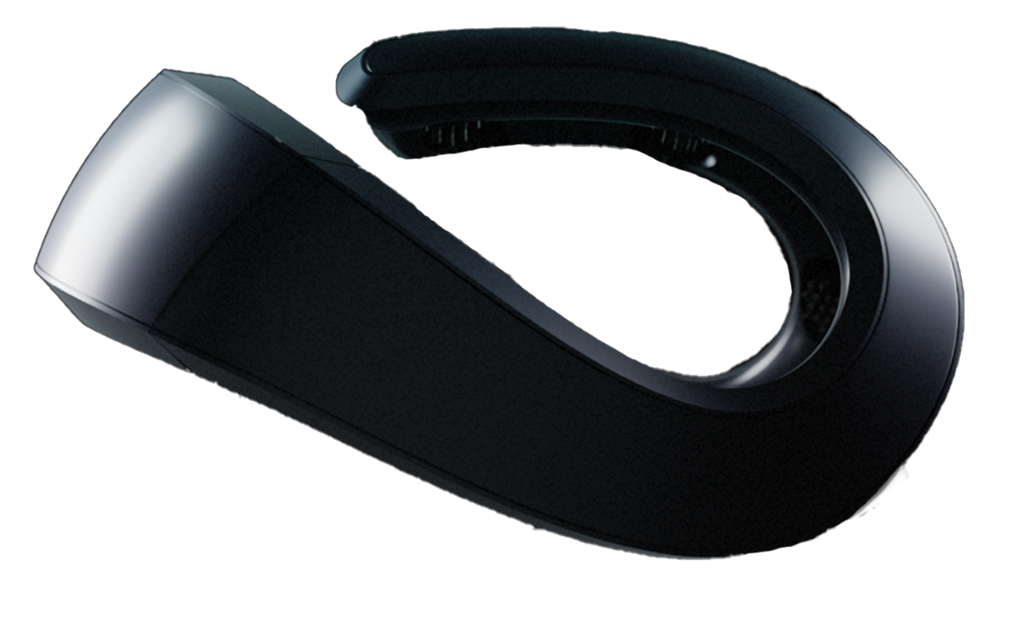
The Neurosity Crown sits at a particularly interesting point in this landscape. Eight channels covering frontal, central, and parietal regions means you get the three most important UX metrics: frontal theta (cognitive load), parietal alpha (engagement), and frontal asymmetry (emotional valence). The 256Hz sample rate captures event-related potentials with millisecond precision. And because it weighs 228 grams and uses dry electrodes, participants forget they're wearing it within a few minutes. That last point matters more than you'd think. The moment a participant becomes self-conscious about a heavy gel cap on their head, their behavior changes. Their brain activity changes. You're no longer studying a user interacting with a product. You're studying a user interacting with a product while being distracted by a weird thing on their head.
The Crown's open SDK ecosystem is the other piece that makes it practical for UX research. You can write a Node.js script that timestamps EEG data to your prototype interaction events, compute rolling theta/alpha ratios in real time, and pipe everything into your existing analysis pipeline. No proprietary software. No vendor lock-in. Just brain data as a first-class data stream alongside your behavioral telemetry.
The "I Had No Idea" Finding: Your Brain Decides Before You Do
Here's the finding from EEG-based UX research that genuinely changes how you think about design decisions.
In 2017, researchers at Delft University of Technology ran an EEG study on first impressions of web interfaces. They found that the brain's response to visual design, measured through event-related potentials and frontal alpha asymmetry, predicted user preference and trust ratings with higher accuracy than the users' own explicit ratings predicted their subsequent behavior.
Read that again. The brain's electrical response at 200 milliseconds predicted what users would actually do better than what users said they would do.
This means your brain makes design judgments at a speed and depth that your conscious mind simply cannot access. By the time you "decide" whether you trust a website, your occipital and frontal cortex have already processed the color palette, the typography, the layout hierarchy, and the visual density, and rendered a verdict. Your conscious experience of "deciding" is more like a press secretary reading a statement that was already written.
For UX researchers, this finding is both humbling and exciting. Humbling because it means years of post-hoc survey data have been measuring the press secretary, not the decision-maker. Exciting because EEG gives you direct access to the decision-maker for the first time.
Common Pitfalls (And How to Avoid Them)
EEG in UX research isn't magic, and it's easy to do poorly. Here are the mistakes that plague early adopters.
Pitfall 1: Treating EEG as a mind reader. EEG measures general cognitive states, not specific thoughts. It can tell you that cognitive load increased at timestamp 14:32:07. It cannot tell you that the user was thinking "this dropdown menu makes no sense." Always pair EEG with behavioral data and interviews to interpret the signals.
Pitfall 2: Ignoring artifacts. Eye blinks, jaw clenches, and head movements all contaminate EEG data. In a standard usability session, users are talking, moving, and looking around. If you don't have a strong artifact rejection pipeline, you'll mistake muscle noise for brain activity. The Crown's on-device signal quality metrics help here, flagging channels with poor contact or excessive artifacts in real time, but you still need to build artifact rejection into your analysis workflow.
Pitfall 3: N=5 and calling it science. EEG data has high within-subject reliability but moderate between-subject variability. Running 5 participants and drawing population-level conclusions is a recipe for false discoveries. For UX studies using EEG, plan for 15 to 30 participants minimum. The good news: with consumer devices that take under 2 minutes to set up, running 20 participants in a day is entirely feasible.
Pitfall 4: Analyzing means instead of moments. The average theta power across a 10-minute session tells you almost nothing useful. The theta spike at the exact moment a user encountered an ambiguous icon tells you everything. Always analyze time-locked event data, not session averages.
Pitfall 5: Forgetting the baseline. Without an individual baseline, you cannot compare brain activity across participants. One person's resting theta might be another person's high-load theta. Always collect a pre-task resting baseline and compute all metrics as relative changes from that individual baseline.
What This Means for the Future of Product Design
Something genuinely new is emerging in UX research, and it goes beyond just adding another data stream.
When you combine EEG with modern machine learning, you can build models that predict user experience in real time. Not after the session. Not from a survey. In the moment. A system that watches a user's frontal theta rising, detects the approach of a frustration threshold, and triggers an adaptive response. A simplified layout. A contextual help tooltip. A different information architecture entirely.
This is neuroadaptive design, and it's not theoretical. Researchers at Tufts University have demonstrated closed-loop systems that adjust task difficulty based on real-time EEG metrics. Airbus has explored EEG-driven cockpit interfaces that simplify when pilot cognitive load gets dangerously high. The same principle applies to any digital product.
The Neurosity Crown's architecture was designed with this kind of real-time feedback loop in mind. On-device processing through the N3 chipset means the latency between neural event and digital response can be milliseconds, not seconds. The SDK provides real-time focus and calm scores alongside raw EEG, giving developers the building blocks for neuroadaptive applications.
We're approaching a point where products don't just passively wait for user feedback. They listen to the user's brain and adapt. Not by reading thoughts. By reading the cognitive and emotional state that shapes the experience, and responding to it.
The Research Lab Is Moving to Your Desk
A decade ago, if you wanted to run an EEG study on user experience, you needed a neuroscience lab, a technician, conductive gel, and a budget that would make most UX teams weep. The studies that got done were important but rare, published in academic journals that practicing designers never read.
That barrier is dissolving. Consumer EEG devices with open SDKs have collapsed the cost and complexity of neurophysiological UX research by orders of magnitude. A UX researcher with a Neurosity Crown and basic JavaScript skills can build a research pipeline that would have required a full neuroscience lab five years ago.
The question isn't whether brain data will become a standard part of UX research. The economics and the science are both pointing in the same direction. The question is who figures out how to use it first.
Because here's the thing about products that are designed around how the brain actually processes information, rather than how users say they process information: they don't just perform incrementally better on A/B tests. They feel different. They feel like someone actually understands what it's like to be a human using a computer. That feeling is notoriously hard to create through surveys and heatmaps alone. But when you can see what the brain is doing at every moment of the interaction, the path to that feeling becomes visible for the first time.
Your users have been telling you the truth all along. You just needed the right antenna to hear it.